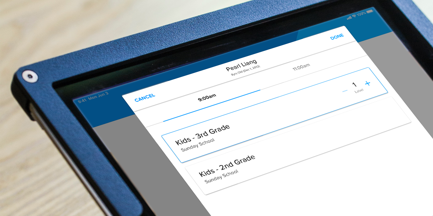
Checking individuals into class, events or serving assignments quick and easy.
⇂
Involvement
PLATFORM : Browser, iOS & Android
ROLE : Lead Designer
Research & Testing
User Experience
Information Architecture
Overview
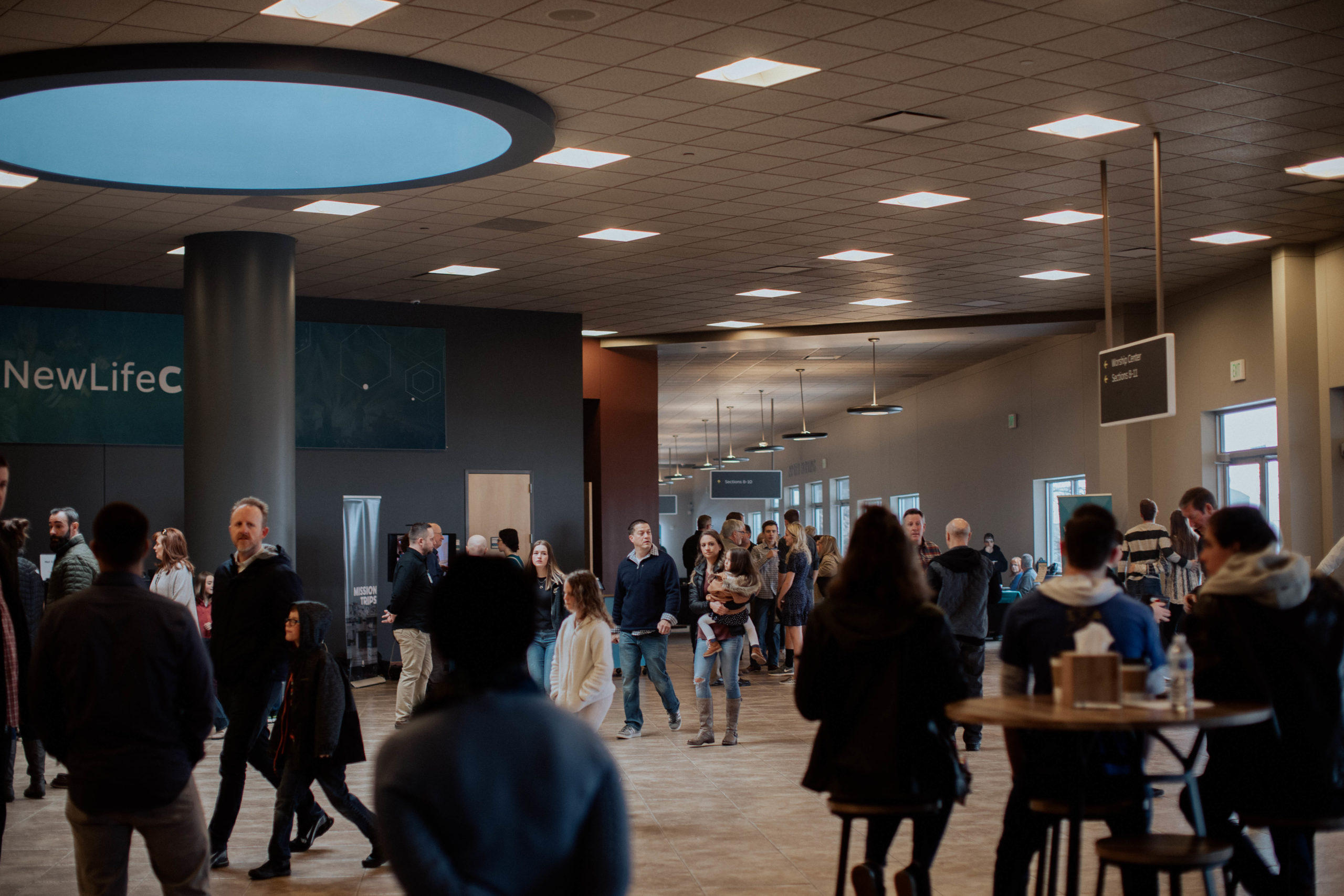
A check-in system is a mission critical tool for churches. It can make or break a new guests experience if they have to wait in line too long, or if they don't feel their children's safety is a top priority. It can also help track event attendance and volunteer engagement. After shipping a complete redesign–before I was hired—we heard a lot of feedback around the amount of clicks and speed it took for guests to check-in. So we set off to identify the problems users were encountering and rethink our solutions.
Process
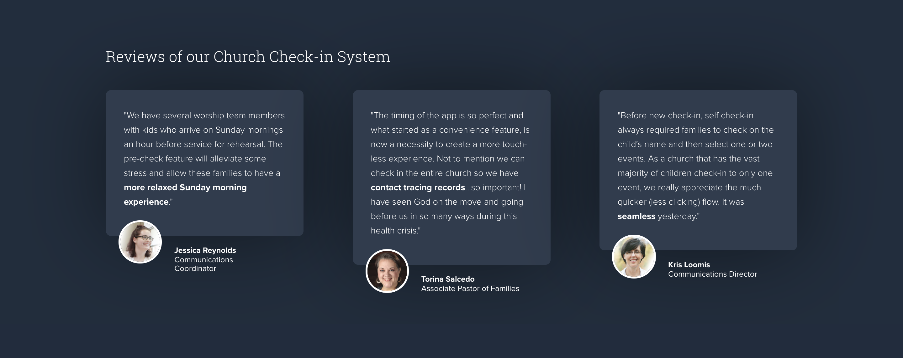
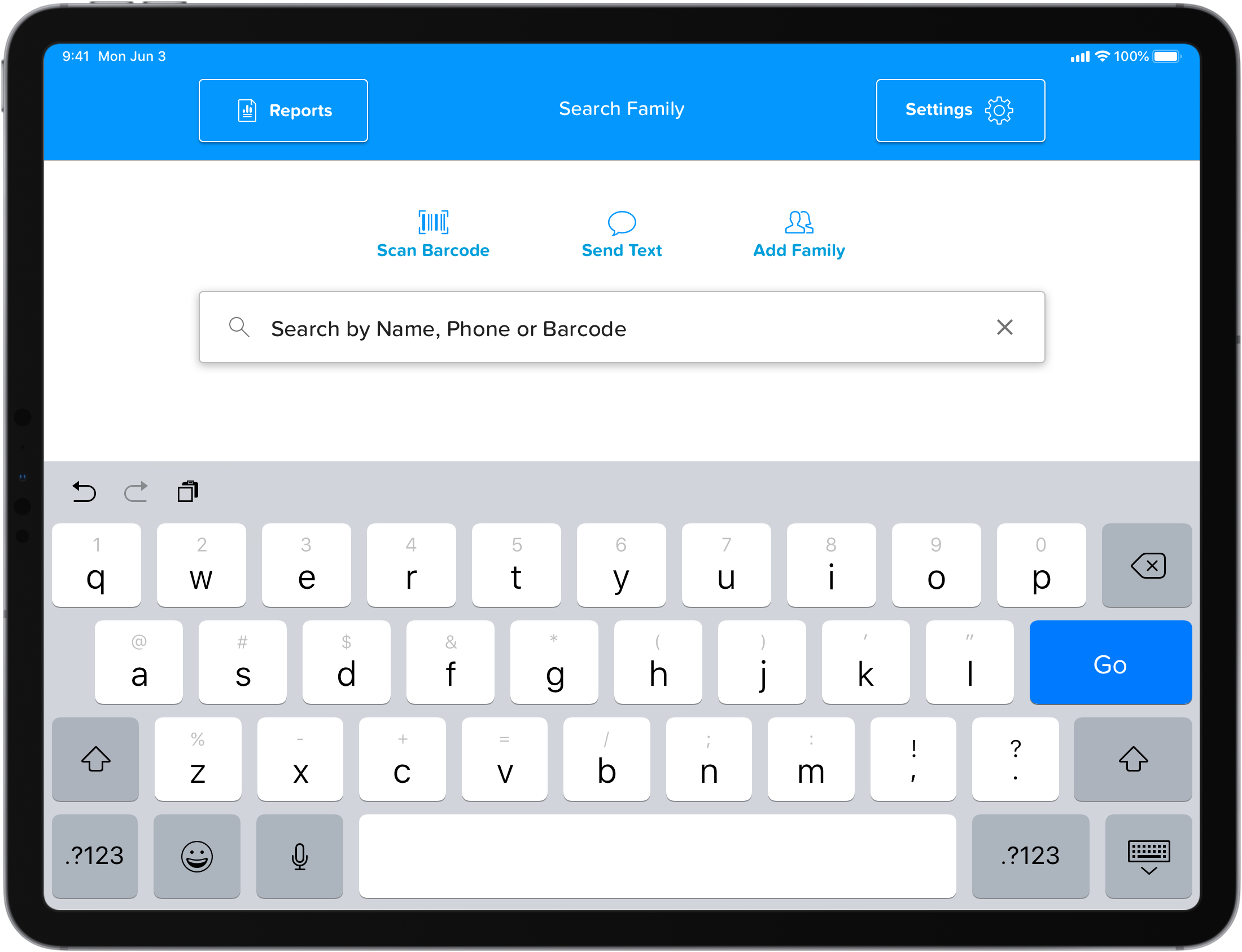
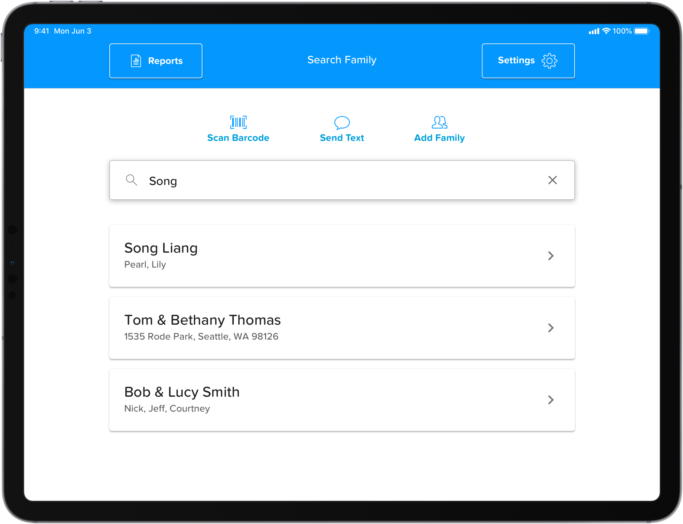
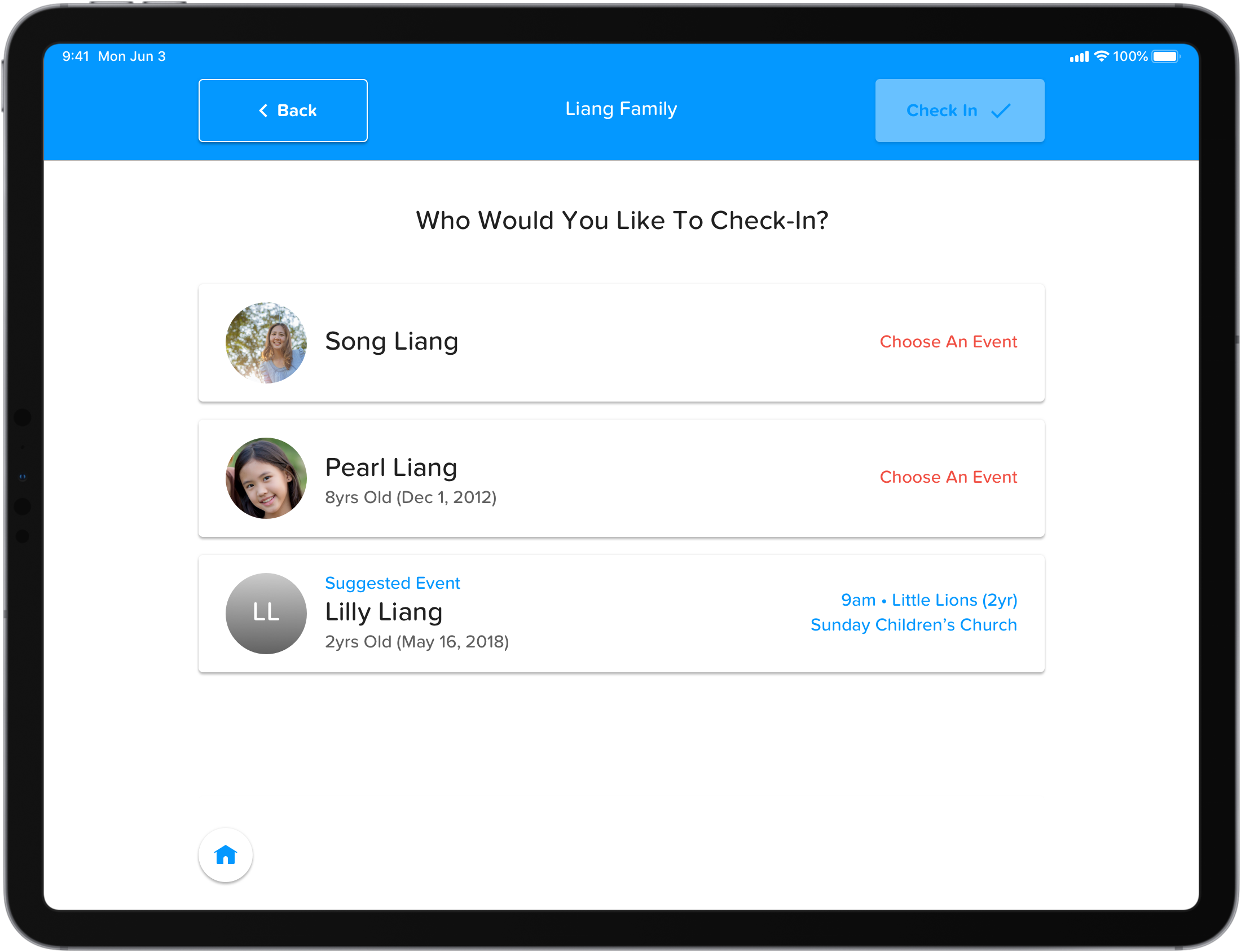
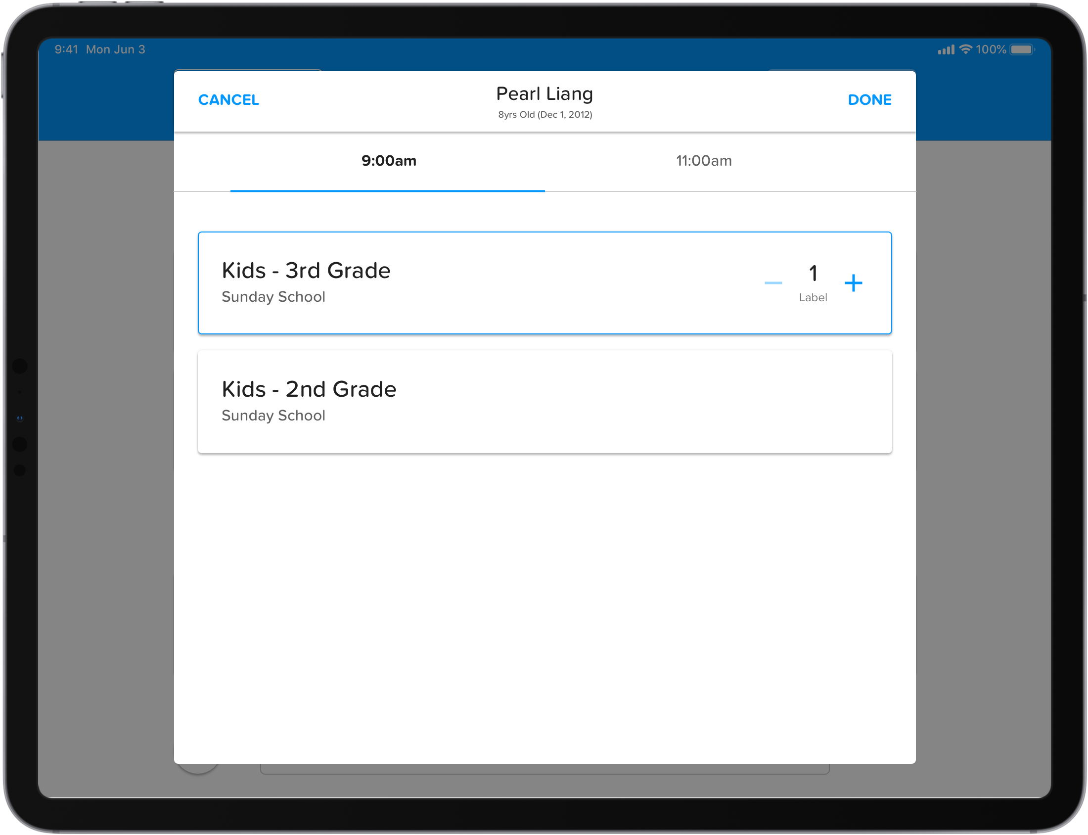
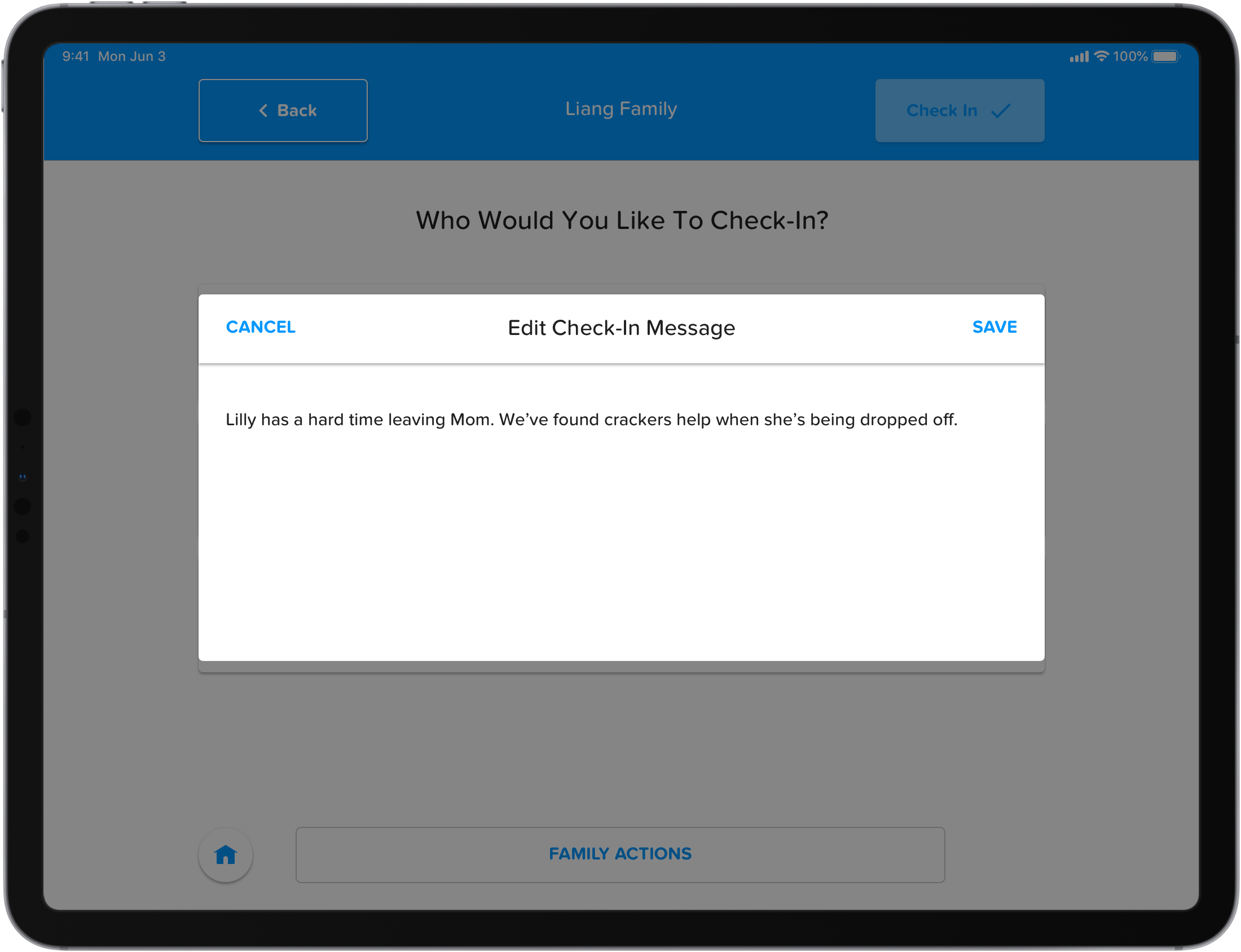
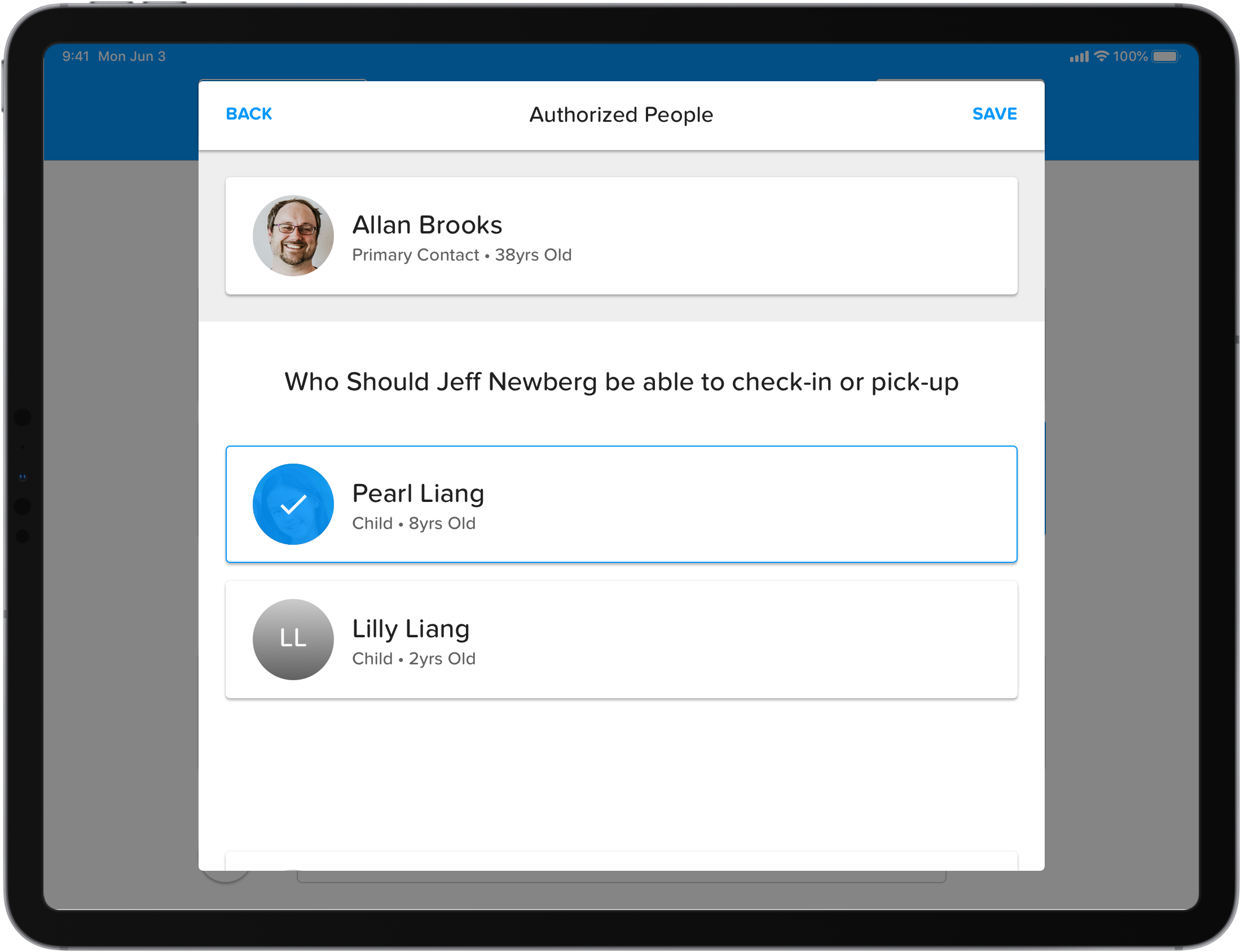
Our customers biggest feedback was the amount of clicks it took to actually check an individual and family into an event compared to the old flow. The old flow utilized modals where-as the recently released flow moved towards a stepper flow. All though this increased clarity, it lacked in flexiblity. After getting feedback on a few protoypes we landed on going back to using modals so the user could always have a clear understanding of any actions taken on a family member. This also allowed us to keep the action buttons in a similar location to help train the user where to click to advance or cancel/close a modal and optimize the speed of the check-in process. Lastly, we also created a more cohesive component library with larger click areas since most of our customers were using touchscreen devices.
Tablet Designs
Phone Designs
![Check-In_App [Search Family]](https://basikmedia.net/wp-content/uploads/2021/02/Check-In_App-Search-Family.png)
![Check-In_App [Family Screen]](https://basikmedia.net/wp-content/uploads/2021/02/Check-In_App-Family-Screen.png)
![Check-In_App [Choose an Event]](https://basikmedia.net/wp-content/uploads/2021/02/Check-In_App-Choose-an-Event.png)
